
I have been fortunate enough to work with Iowa Spring Manufacturing off and on for many years. This has allowed me to create a lot of brand consistency for them, starting with their letterhead. The thin-lined grid structure used on these pieces has carried through all of Iowa Spring's marketing. It serves as a great unifying element, no matter what we're designing.
Several years ago Iowa Spring expanded, opening a second facility in North Carolina. However, since the family-owned company had spent more than 30 years earning their great reputation, they had no interest in changing their name. Instead, both locations are marketed together as one, resulting in two logos and two addresses on most pieces.


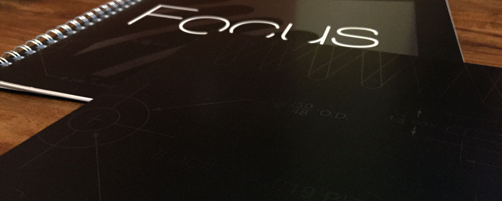
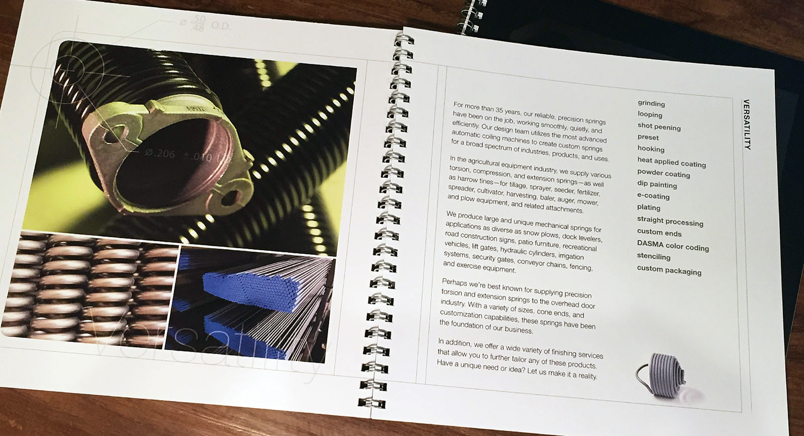
The industry-specific capabilities sheets shown above have been used for years by their salesmen and as tradeshow handouts. Recently we printed folders and a square booklet so Iowa Spring can assemble customized packets for potential clients. The folder is fairly simple in design but has one powerful statement on the inside cover: "Springs. We do just one thing, and we do it well." The brochure is designed around the word "focus," illustrating what Iowa Spring believes to be one of their biggest strengths. Most of their competitors manufacture other products too, most of which have nothing to do with springs or the industries they serve. Iowa Spring prides themselves on giving their clients 100% of their attention.
To add some design detail to the booklet, I used pieces of their technical drawings. In some cases, it serves as a bullseye, highlighting a feature on the page. In other cases, on the covers for example, it adds visual texture. We printed the covers with both dull and gloss varnish to add dimension and interest.
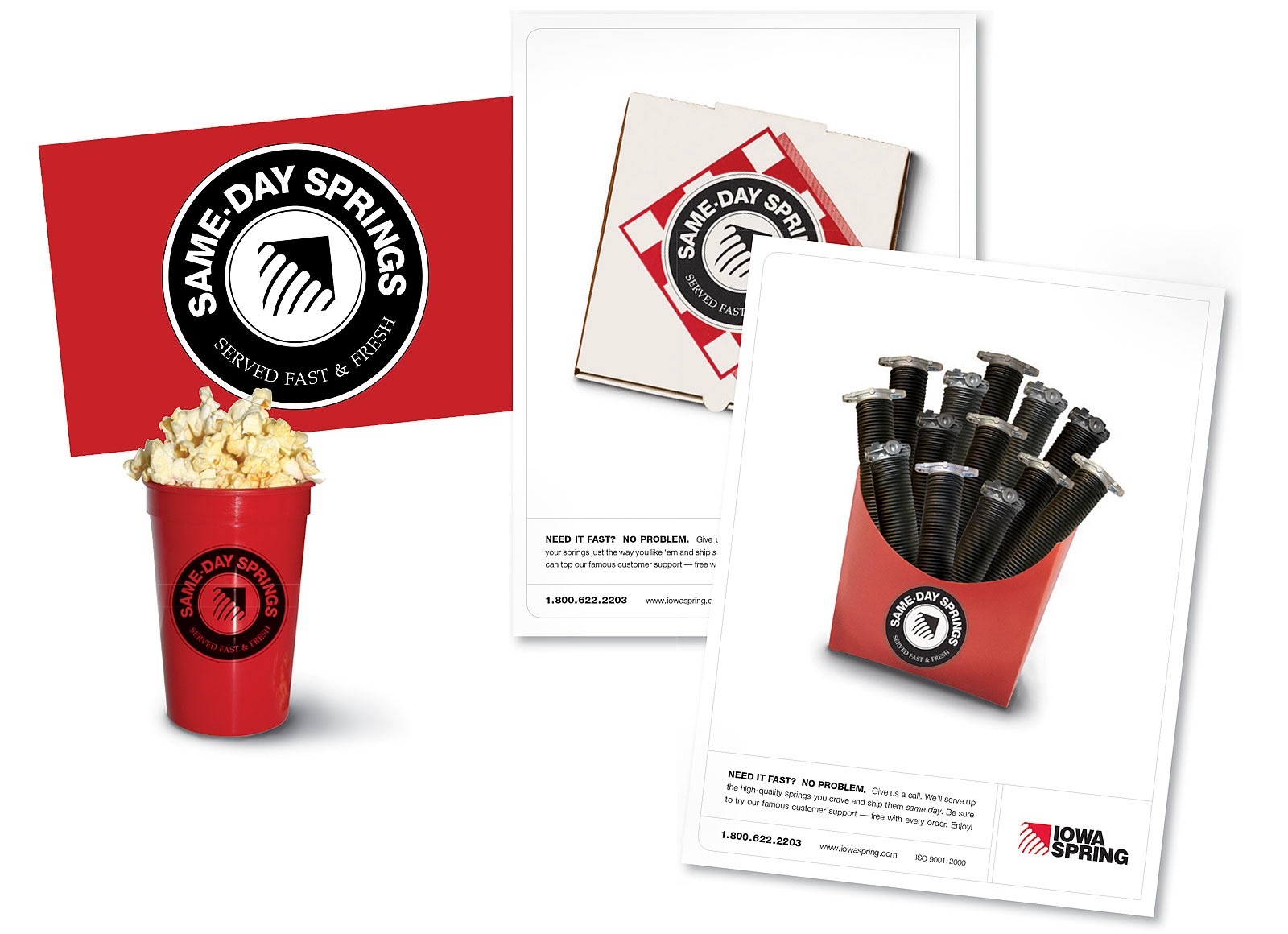
This Same Day Springs campaign will always be one of my favorites. Iowa Spring was in the process of rolling out a trial program for same-day shipping on certain high-inventory products. They were going to be exhibiting at a national garage door trade show (their biggest market), where they wanted to announce the details of the program.
How could we put a fun twist on this to stand out from all the other product ads in the trade publications? How could we generate some interest before the show? How could we tie it all together with their booth and handouts? During a brainstorming meeting with the account manager, I came up with the concept to link this new program to the idea of fast food — quick gratification, consistent product delivery, and easily recognizable. One thing led to another, and it turned into a very effective campaign. We named and branded the program with a stamp-like logo. Full page "pizza" and "fries" ads ran in trade magazines prior to the show, a postcard was mailed to all registered attendees, and fresh popcorn was handed out at the booth.
The program took off rapidly, but it pushed their production capacity too far. They were having a hard time keeping the Same Day promise on all orders. As a result, the program was revamped and renamed, creating the QuickShip program.
